Do I Really Heat Up My Home Office? A Data-Driven InvestigationPublished on
The Idea
Our European summer is hot. Like, at least for us, heatwave hot. I live in a flat with two floors. My home office is located on the ground floor, and I wanted to measure the temperature difference I make by working from home. After all, heat doesn't always come from outside. With me sitting in the same room for several hours with multiple electronic devices, I was curious whether and how much of a difference I make by myself.
First, I looked at many different sensors since I needed one that somehow had some sort of history and an open interface that I could use to track the temperature over time (basically 24/7).
For my use case, there was just one clear winner: SwitchBot temperature sensors. They store a local history that can be fetched via a Bluetooth app and also exported. Moreover, the SwitchBot sensors can be used in a Home Assistant setup, so if I ever choose to extend my whole "smart home," I am already prepared for the next step.
The Goal
I want to know whether working from home makes a difference to the room temperature.
I will record the temperature over one week in three different locations (outside, bedroom, and my office room at home). This way, I can correlate the temperatures with each other. During this week, I will be working both from home and from the office.
The Implementation
I placed the Sensors on steady places ready to record.
.... 1 Week later (in Spongebob narrator voice) ....
First, to get to the sensor data, we have to open the app and simply export the data we are interested in via the export button. This gives us a CSV file in the following format:
Date,Temperature_Celsius(℃),Relative_Humidity(%),DPT(℃),VPD(kPa),Abs Humidity(g/m³)
"Jun 21, 2026 22:00","28,9",43,"15,1","2,27","12,28"
"Jun 21, 2026 22:01","28,9",43,"15,1","2,27","12,28"
"Jun 21, 2026 22:02","28,9",43,"15,1","2,27","12,28"
"Jun 21, 2026 22:03","28,9",43,"15,1","2,27","12,28"
"Jun 21, 2026 22:04","28,9",43,"15,1","2,27","12,28"
"Jun 21, 2026 22:05","28,9",43,"15,1","2,27","12,28"
"Jun 21, 2026 22:06","28,9",43,"15,1","2,27","12,28"
"Jun 21, 2026 22:07","28,7",44,"15,2","2,20","12,43"
"Jun 21, 2026 22:08","28,7",44,"15,2","2,20","12,43"
So, with three different CSV sources ready, I now wanted to visualize the data. Since I already use Obsidian, I thought it would be nice to have the visualization integrated into my existing workspace.
My goal is simply to visualize the data, nothing else. For that particular reason, I just asked my AI for a quick solution (which didn't work out of the box anyway, unfortunately). To cut it short, I used a combination of Plotly and the Dataview plugin, all inside a single code block.
```dataviewjs

const base = app.vault.adapter.basePath;
const Plotly = require(base + "/libs/plotly-3.6.0.min.js");

// Load CSVs
const files = [
    { name: "Sensor 1", path: "Outdoor_Meter_1_data.csv" },
    { name: "Sensor 2", path: "Outdoor_Meter_2_data.csv" },
    { name: "Sensor 3", path: "Outdoor_Meter_3_data.csv" }
];

// Load all CSVs using dv.io.csv()
const datasets = await Promise.all(
    files.map(f => dv.io.csv(f.path))
);

function parseTimestamp(str) {
    // str example: "Jun 23, 2026 16:47"
    return new Date(Date.parse(str));
}
const traces = datasets.map((df, i) => {
    const rows = df.map(r => {
        const rawTemp = r['Temperature_Celsius(℃)'];

        return {
            date: parseTimestamp(r.Date),
            temp: (!rawTemp || rawTemp.trim() === "")
                ? null
                : Number(rawTemp.replace(",", "."))
        };
    });

    // Sort by timestamp (also critical)
    rows.sort((a, b) => a.date - b.date);

    return {
        name: files[i].name,
        x: rows.map(r => r.date),
        y: rows.map(r => r.temp),
        mode: "lines",
        connectgaps: false
    };
});


this.container.style.width = "100%";
// Plot
Plotly.newPlot(this.container, traces, {
    title: "Temperature Over Time",
    xaxis: { title: "Timestamp" },
    yaxis: { title: "Temperature" }
},
    { responsive: true });
```
I have a local libs folder inside of my Obsidian Vault in which plotly-3.6.0.min.js is contained.
The Graph
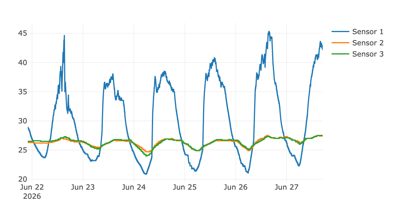
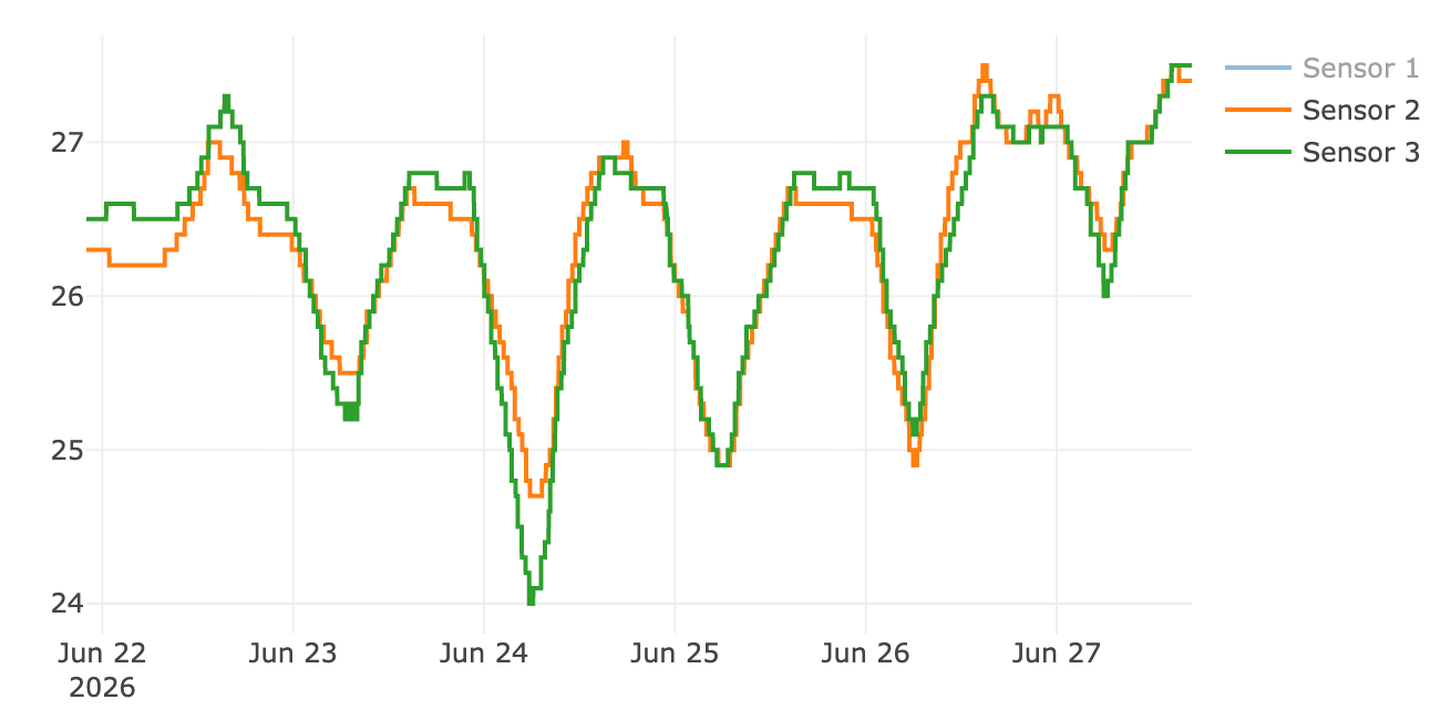
Sensor 1 is obviously the one from the outside (it was exposed to the sun as well).
Sensors 2 and 3 are the ones inside, but there are barely any differences.
Bet you wouldn't know which days I worked from home and which days I was at the office.
The Final Verdict
Based on the data and the visualization, I can conclude that it made no difference whether I was working from home or not, which means that I, my laptop, and my electronic devices made no difference to the room temperature at all.
Case closed.